The True Story Behind Hollywood Studio Logos

- Factofusion


VIVA – The film is an extraordinary work and can entertain the audience. To work on a film is not easy and requires a lot of crew. So, all the credit goes to the production company involved in making the film.
Also, when people watch a movie, they usually have to go through the opening with the logo of the film studio first. These logos have a very amazing history behind them.
Hollywood Studio has a long history behind its film production logo. So, here’s an explanation of true story about logo from a Hollywood studio.
1. The Walt Disney

Walt Disney
- Youtube
The true story of Disney's Hollywood logo was started by brothers Walt and Roy Disney. The Walt Disney Company is the largest and most famous animation and film production studio in Hollywood and the world. Known for some of his amazing film productions like Jungle Book, Cinderella, Mickey Mouse, and many more.
Disney can be very famous for using Walt Disney's signature for the introductory title of the film. That's because Walt Disney wanted to give a personal touch to all his films.
All the signatures embedded in his films are different because his signature is always changed to achieve the perfect signature for himself. It was in the late '80s when Disney first released its logo on a blue background with a castle from the movie Cinderella and the text of Walt Disney Pictures.
The castle in the logo is inspired by Neuschwanstein castle or the new Swanstone Castle from the 19th-century Romanesque, village in southwest Bavaria, Germany.
The Disney logo then underwent a complete 3D transformation following the acquisition of Pixar, where the camera was zoomed out of the castle, with the flag on the castle now moving and Walt Disney Pictures appearing in 3D style font.
After that, a star will appear and draw a line on the back of the castle. Yep, Loopy D. This hidden Loopy D is supposedly taken from this Signature of Walt Disney. Even though the big bold loopy D was not legible, it had to be made as a signature for the entire company it now uses such as Disney Channel, Disney Studios, and Disney World.
2. Metro Goldwyn Mayer (MGM)
Logo Metro-Goldwyn-Mayer (MGM)
- mgm.com
Metro Goldwyn Mayer (MGM) was founded by merging three different image studios in the US. Marcus Loew, a successful businessman in the US bought Metro Pictures Corporation and Goldwyn Pictures, Louis B. Mayer Pictures, and together formed his company Metro Goldwyn Mayer.
The MGM logo designed by Howard Dietz has a roaring lion and is taken from a real lion. There are two famous stories behind the lion logo for MGM.
First, shows respect to Columbia University's Alma Matter athletic team nicknamed 'The Lions'. Second, it is believed that Howard took the Lions from the name Marcus Loew, whose German surname translates to a lion. The logo uses many lions for various versions of its logo.
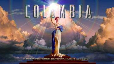
3. Columbia Pictures

Columbia Pictures
- Factofusion
Columbia Pictures was originally founded as Cohn-Brandt-Cohn Film Sales which was later changed to Columbia Pictures in 1924. The original logo looks simple and the design is sketchy. The woman torch that we often see in the logo is inspired by Lady Columbia who is a forgotten symbol of the American woman.
Columbia Pictures' initial logo was of a Roman soldier woman with a shield and staff in her hand. Then it changed and was inspired by Lady Columbia, a torch woman with a headdress on her forehead and a flashing torch light.
In more recent versions of the logo, the headdress and flickering are removed. Until finally the logo we see today was created by Michael J Deas, who painted the entire logo matte.
The woman in the painting is Jenny Joseph for the reference photo that illustrator Michael Deas will use as the basis for the Columbia Pictures logo painting. The photo was taken at photographer Kathy Anderson's apartment in New Orleans in 1992.
4. 20th Century Fox

20th Century Fox
- Factofusion
William Fox founded FOX FILM CORPORATION in 1915, but as the company went bankrupt, the company eventually merged with 20th Century Pictures and the monumental 20th Century Fox logo was created. That was the beginning of the true story of the Hollywood 20th Century Fox logo.
The logo was originally painted by Emil Kosa Jr. Kosa and replaced 'Pictures Incorporate' in the original 20th-century logo with FOX. Later, Rocky Longo repainted the FOX logo keeping the design as is, but making it brighter and giving a clearer look to the entire logo.
In the late 90s, 20th Century FOX Pictures introduced its first animated CGI logo, with the new text 'A News Corporation Group' added at the bottom.
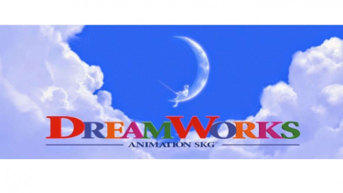
5. Dreamworks Studios
Logo DreamWorks.
- U-Report
Dreamworks studio was started by Steven Spielberg, Disney chairman Jeffrey Katzenberg, and record producer David Geffen. The Dreamworks Studios logo represents a boy fishing from the moon.
The logo idea first emerged from Spielberg which will remind people of the golden age of Hollywood. Spielberg asked Robert Hunt to draw a logo that contained a boy instead of a man fishing from the moon.
Under the Dreamworks logo, it says Animations SKG, which stands for the initials of Spielberg, Katzenberg, and Geffen. The boy in the logo is the son of designer Hunt.
The logo was then animated using computer graphics and the current Dreamworks logo is a colorful version against a background of clouds and clear skies.
6. Warner Bros Pictures

Warner Bros
Warner Bros Studio was opened by Warner Brothers and became the first studio in Hollywood. The original logo depicts the text 'Warner Brothers' at the top with a shield in the center containing WB along with an original photo of Burbank California Studio, where Warner Bros. first started. The logo underwent more than 200 changes in just the last 15 years.
The current logo we see is a completely CGI-based logo, with a Golden Shield containing the words WB with a ribbon on it written as Warner Bros Pictures. However, the colors and logo designs nowadays tend to change with the theme of each movie.
7. Paramount Pictures

Paramount Pictures
- Factofusion
The Hollywood logo of Paramount Pictures was founded more than 100 years ago, as the Famous Players Film Company, which later merged with the Feature Player Company.
The first logo designed by William Hodkinson was a single mountain peak, surrounded by 24 stars around it. Each star represents an actor or actress who is contracted by the most important images of the time. The mountain in the logo is Mount Ben Lomond in Utah. The logo has since undergone several changes and transformations over time.
The logo was originally just gray but changed to more color and finally, the current Paramount Pictures logo was first released in Mission Impossible: Ghost Protocol.
Paramount in the new Penultimate Font style has finally appeared. The logo now consists of only 22 stars which were previously modified in the 1970s and remains today. There is no specific reason for the change in the number of stars, actually given by the most important representatives.

Heboh Kasus P Diddy, Viral Lagi Pernyataan Agnez Monica Soal Sisi Gelap Hollywood
Penyanyi Agnez Mo ikut menjadi sorotan setelah kasus yang menyeret Rapper P Diddy menjadi heboh. Sebagai artis Indonesia yang namanya sudah terkenal di kancah global.